Nine out of ten adults in the UK aren’t getting the nutrients they need, with more than half of daily meals made up of ultra-processed foods. Meanwhile, many in the supplement industry are making promises they can’t keep.
Supplement brand, Tonic, is on a mission to illuminate the truth, expose the lies in the industry, and provide supplements that give adults exactly what their bodies need – no unnecessary extras and no compromises, at an accessible price that democratises people’s health.
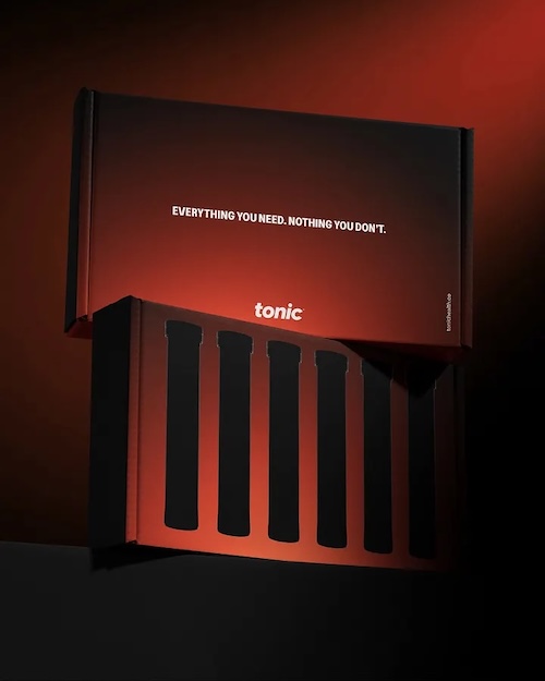
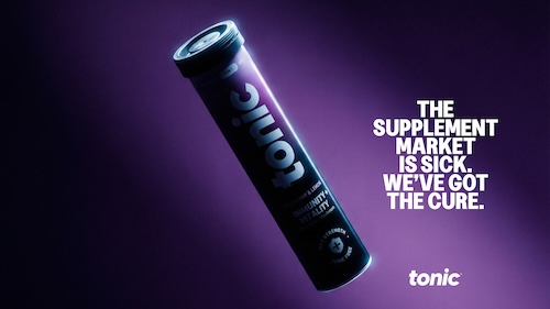
Among Equals has translated this mission into a bold, modern brand identity that brings Tonic’s values to life, both visually and verbally. The new brand world, covering packaging to digital presence, illuminates the brand’s clarity, trust, and purpose, ensuring adults have the information they need to make informed choices about their health.
The new work combines insight-driven design with Tonic’s science-backed approach to supplementation to create a brand that doesn’t just sell vitamins, it champions a lifestyle where adults can truly thrive, ensuring adults get everything they need through Tonic and nothing they don’t.
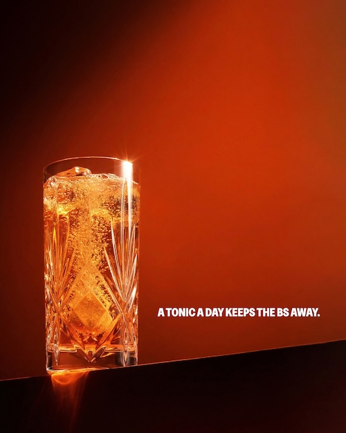
Light and illumination lie at the heart of Tonic’s refreshed brand world, serving as a literal and honest expression of the brand’s mission. Rather than relying on symbolic health cues or decorative elements, the updated identity uses light to reveal what truly matters, key information, and guide attention. By emphasising what matters most, from product messaging to vital ingredient details, the system helps people build knowledge and make informed decisions about their health, and feel empowered in their choices. The logo was also reimagined in collaboration with designer, Rob Clarke, evolving into a bolder, more confident expression that aligns with Tonic’s ethos – everything you need, nothing you don’t.
Emily Jeffrey-Barrett, founder of Among Equals, commented, “From the very start, our goal was to create a brand world that truly reflects Tonic’s mission: to shine a light on real health. In a market often cluttered with noise and gimmicks, we wanted to design something honest, clear, and empowering – something that helps adults make informed choices and feel confident in their wellbeing. Light became the perfect metaphor and tool, guiding attention to what matters most: the products, the ingredients, and the promise of everything you need, nothing you don’t. Working with Tonic has been about more than design – it’s been about helping a brand lead the way in redefining how people think about their health.”
The new identity is now reflected across Tonic’s products, packaging, and digital platforms, with much more to come.