A new brand identity whose meaning is easily understood? This one by Among Equals for The UK Centre for Ecology & Hydrology (UKCEH), one of the world’s leading environmental research institute is, and that makes it a standout.
The generative design system turns scientific understanding into a living visual language. At the heart of the brand lies a simple idea. It decodes our planet. When most of us look at a river, a field or a storm, we see nature’s beauty. UKCEH sees systems — the invisible patterns of data and interconnection that hold the living world together.
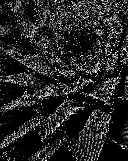
This perspective is brought to life for people through a series of animated fractals, co-created with creative coder, Tim Rodenbroeker, and developed in partnership with UKCEH’s experts.
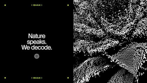
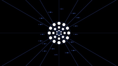
Each fractal follows the same mathematical principles that shape our natural world, behaving as if alive, shifting, and reforming over time. Representing land, water and air, the fractals visualise the geometry that underpins every ecosystem – a river flowing and folding endlessly, a sunflower radiating in infinite recursion, lightning fracturing through darkness.
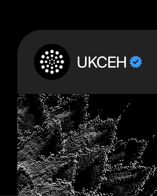
The logo follows the same principle – a simple mark rooted in the same natural code. Together, the work creates a generative system that reflects the world UKCEH explores – adaptive, interconnected, and constantly evolving alongside their science.
As the fractals shift, they move in murmuration — thousands of independent data points reforming in unison, mirroring the behaviour of birds in flight. Moving through them feels cosmic, almost quantum — a reminder that from particle to planet, every element of our world is interconnected.
Kelly Lea, head of communications & engagement at UKCEH, stated,“Our work is about decoding and harnessing environmental science so nature and people can thrive. This identity doesn’t just reflect that mission — it amplifies it. Our scientists uncover patterns and connections that shape global policy and understanding across land, water and air — from climate to soil to biodiversity. These discoveries help the world see what’s really happening beneath the surface — and that brings hope. This new identity captures that same spirit: rigorous, curious and optimistic about what science can achieve.”
The visual system is supported by typography that communicates modernity and photography that celebrates UKCEH’s muddy-boots approach — scientists in the field, decoding ecosystems one data point at a time.
Emily Jeffrey-Barrett, founder of Among Equals,“From the beginning, we knew this brand had to behave like the environment itself. It couldn’t be static. It needed to breathe, evolve, and respond — just as UKCEH does. The generative fractal system allowed us to build a visual world that’s both grounded in data and emotionally resonant — a living reflection of how UKCEH sees the planet.”
In a world saturated with stories of crisis, the UKCEH rebrand by Among Equals hopes to reframe environmental science as a source of clarity, connection, and hope — a reminder that understanding our planet is the first step toward protecting it.