In July 2014, a two-stage tender process began for The Bennelong Restaurant in the Sydney Opera House, six months after Guillaume Brahimi ended his 12 year ‘reign’.
In November 2014, Fink Group and Australian chef, Peter Gilmore, won the tender. The new Bennelong Restaurant will include a signature Gilmore dining room and a less formal restaurant bar on the upper level.
The Fink Group brought Saatchi & Saatchi on board to create a brand identity for their new venture.
The brief spanned the full breadth of the restaurant and customer experience.
It began with the branding itself, including the associated story and iconography. And it included every aspect of the restaurant – signage, menus, glassware, stationery…staff uniforms.
Tod Duke-Yonge, head of design, Saatchi & Saatchi noted, “It’s not often that you get to work on one of the world’s architectural icons, let alone do it with arguably Australia’s greatest chef. We were also very lucky to work with TZG Architects from an early stage to ensure the restaurant’s identity captured the unique spirit of the location.”

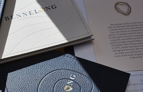
The visual identity Saatchi & Saatchi created created was inspired by the site – its location, history and the Opera House building itself. Before 1788, Bennelong Point was an island. Women from the local Aboriginal tribes would gather there. They would eat the local shellfish and pass on their stories and traditions to the younger generations. The agency got the idea of shell midden from the original location and its history and combined it with the site’s most significant references from its relatively recent history – Jørn Utzon’s architectural blueprints of the Opera House.
A series of overlapping lines was created to bring the ‘o’ of Bennelong to life as a shell. The layering effect is representational of the site’s significance as a midden and is a key aspect of the branding. It also reflects Utzon’s skeleton-like sketches of The House in its earliest form. And it represents the site’s history as an island. Contributing to the ‘o’ as an island is a series of topographic lines emanating from it. These lines are used as a textural device, drawing the eye in to the centre of the Bennelong logotype.