Vision Australia appointed Designworks earlier this year to help it overcome a number of challenges. Although Vision Australia is Australia’s largest provider of disability services to people who are blind or have low vision, the organisation had discovered through research that many people didn’t know about it or its mission to support people who are blind or have low vision to live the life they choose.
This understanding also came at a time when the not-for-profit industry and funding models were under significant pressure. Vision Australia knew that it needed to build brand awareness and differentiation from other disability service providers and charities.
“So we needed to have a look that makes us stand out from the rest,” stated Megan McAlpine, chief marketing officer, Vision Australia.
Designworks’ first task was to create a brand that would demonstrate the organisation’s commitment to putting its clients at the centre of everything it does, beginning with brand strategy and positioning and following through to full identity development, and architecture. The comprehensive rebranding programme took eight months.
The new brand expression evokes the idea of linking Vision Australia’s clients staff, volunteers, donors and community together in a way that benefits people who are blind or have low vision. The rebrand also includes a new tagline, Blindness. Low Vision. Opportunity, and is supported by a social media presence.
James Sterling, creative director, Designworks commented, “Refreshing the Vision Australia brand required creating a brand identity that was both easily accessible for people who are blind or have low vision and better represents the passion, commitment and exciting transformation the organisation is undergoing to improve service provision and support for its community.
“The key to the success of this project was the willingness of Vision Australia to fully integrate us into their organisation. We attended inductions, visited Vision Australia centres across Australia and were fully immersed in the research process. By the time we finished the project just about everyone in the organisation knew who we were.”
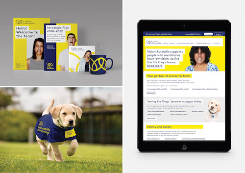
McAlpine added, “Our new brand tells the story of how we put our clients at the centre of everything we do. We now stand out from other providers and charities and our new identity is easily translated across all Vision Australia branding platforms.
“Additionally our new tag line, Blindness. Low Vision. Opportunity, tells people what we do and showcases what we deliver. We are extremely excited about the new brand expression and the story it represents.”
“Everything about the new brand identity meets best practice standards,” Stering continued, “and therefore needed to be both easily accessible for people who are blind or have low vision and highlight the organisation’s ability to link all its key stakeholders together.
“The colours of yellow, navy and white are high contrast and provide best visibility for the people with vision impairment, additionally the font – sans serif – is spaced to aid legibility and most importantly the whole identity is simple so will be clear even on the smallest screen or mobile device.”
The new Vision Australia Seeing Eye Dogs logo and Vision Australia Radio logo also have the same illustration as the Vision Australia logo.
You might also like