Gorgeous, eye-catching animation. Partizan animation studio, H5, has turned a classic brand history into an attention grabber for The Financial Times. Creative agency, Orange Panther Collective, has made that brand history not about the depth of its stories, the journalists who write them nor any of the other newspaper ad claims we’ve all heard before. It’s about the colour pink.
The Financial Times is different. Orange Panther Collective realised that pink is the symbol that makes its different apparent, the symbol that sets it apart. And that its pink story is interesting. Partizan amped up that interest by making the story resemble an animated scrapbook.
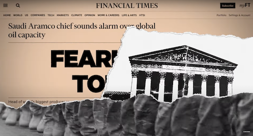
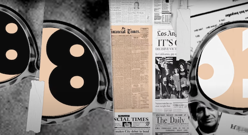
Between them, they reveal how The Financial Times began using paper made from red China clay and how their decision to be ‘fearlessly different’ by not bleaching it resulted in a brilliant distinctive feature of the Financial Times. The FT’s pink paper is distinctive, like the newspaper’s content. And it’s instantly recognisable. Even the newspaper’s headquarters is built in specially selected pink stone, the ad reveals.


Credits:
Creative Agency: Orange Panther Collective
Creative Director: Russell Weaver
Copywriters: Tim Dobbs & Tim Braithwaite
Agency Producer: Dan Savidge


Production Company: Partizan London
Animation Studio: H5
Graphic Designers: Amelie Guilloux & Pauline Levy
Executive Producers: Duncan Gaman & Federico Matarazzo
Producer: Leo Green
Animation & Post Production: Partizan London
Editor: Simon Hervieu
Colour Grading: Machine Molle
Animation Director: Claire Palliser