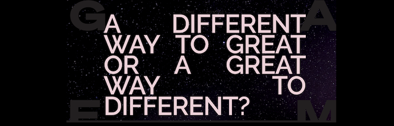
Ah, the proposition. It’s been the cause of more arguments in adland than anything else. When Rosser Reeves sat at his desk in the 1940s and wrote the first unique selling proposition he had no idea what he had unleashed. Across the globe. For nearly 100 years.
Seems like everyone, from the CEO to the cleaner, has an opinion on what makes a killer proposition. But who really owns it? Who wrestles with bad ones? Who turns the good ones into great work? Who has the most to win or lose? Who?
I’ll give you a hint. Find a mirror. It’s you. The creatives.
So, here’s my proposition: As creatives we need to own the proposition process. We need to write, tweak, re-write, edit and distil. Not the suits and planners and clients. Us. That’s because, with all due respect, when we leave it to the supporting cast, we end up with overwritten, over complicated and/or overly clever.
Ultimately, not very useful.
Now, technically I know the readers of The Stable are the users of propositions rather than their writers. But, with the blurring of roles in adland, this is one where we should be happy to immerse ourselves.
So here are my proposition writing tips.
Start by taking away.
There’s a couple of no-nos with propositions:
- No ‘and’. By definition, when you have an ‘and’ your proposition is not single-minded. You’ve got at least two elements.
- No commas. Commas are even worse than ‘and’ as you’ve probably got a triple-header or worse.
- No full stops. You seeing the pattern yet? A full stop is the end of one thought and the start of another. Again, the definition of ‘not single’.
- No ‘em’ dash. Last one, I promise. An ‘em’ dash technically adds to the thought in the sentence it follows. But it’s still a symbol of a multi-headed prop.
The brand is just taking up space.
Starting a prop with the brand name isn’t a terrible way to write a first draft. But remember, the work will use the Design Guideline – that’s colours, type, photographic style, logos. You don’t usually mention the brand in the headline, so you don’t need it in the prop.
Shorter is always better.
If you need more than 15-words then you’re not cutting deep enough. There are too many elements which the supporting cast can point to and say ‘it’s not also saying that’.
Be clear not clever.
Don’t try to write the idea. Or the headline. I once had a proposition presented to me for a cable TV company which was “Live live”. Live rhymes with give. Live rhymes with dive. See, I have to explain it even now. Imagine it on a billboard.
Here’s the analogy I’ve bored everyone with for 25 years.
Look at the target audience on the brief. Think of someone you know who’s a member of that audience. A friend or family member. Old or young. Male or female. Senior or junior. But it must be someone you know.
Now imagine they’re in a lift and the doors are closing.
You have the chance to say one thing to them to get them to open the doors and continue talking to you. You need to say the single sexiest thing possible. If you try to shout eight things, all at the same volume, they’re gone.
Importantly, when the doors open you can talk for as long as you like. You can repeat dozens of bullet points. If you’re really on form, you can hold their attention for an hour.
But your opening gambit has to be good or they’re gone.
Hope that helps. Hope I haven’t just started more arguments. But maybe that was Rosser Reeves’ intention all along.
Rob Morrison is a rarity in advertising – a grey-haired creative. Rob’s experience includes time as a Creative Director at Ogilvy, BWM (now Dentsu Creative), George Patts (now VMLY&R), Campaign Palace and Wunderman. He now runs his own consultancy – morrison.collective.
Here are two more opinion pieces from Rob Morrison: