“Win one, teach one.” During Andy Sandoz’s year as president of D&AD, he brought its mantra to the fore.
“His future-facing attitude has often set him apart from the crowd and his love of the weird and wonderful is legendary,” D&AD stated.
Put simply, Sandoz wants all awarded creatives to look at how they got to where they are, and help to teach the next generation what it takes to make amazing, awe-inspiring creative work.
His final act as president has been to make some changes to the Annual.
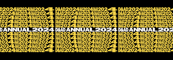
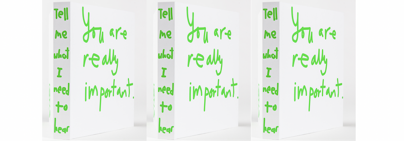
Firstly, it has been renamed the Manual. And this year, for the first time, the Annual isn’t just a record of the best awarded creative work from 2016, it also asks the reader to think about what this work can teach us. It features interactive exercises created by B+A (formerly known as Ben&Andrew), based on lessons from Christopher Ball, Patrick Collister, Nick Eagleton, Thea Frost, Al MacCuish and Andy Sandoz himself.

Andy Sandoz
“This year’s Book is best read with a sharpened pencil and an open mind, so that notes can be taken and questions answered. It’s time to go back to school,” D&AD noted.
“This is no Annual,” Sandoz commented. “ Well, it is. It’s an amazing one. A celebrated collection of the very best in design and advertising from across the globe. No dust-gathering ornament to last year. It’s a signpost to the next. No Annual, this is a manual.”
“Our Pencils remain the most sought after and hard won creative awards in the world. If you are talented enough to win one, then you hold knowledge enough to teach another. The story of your winning Pencil can help others also win. Beyond agency, network or personal gain, you support the industry that supports you. Leave a handhold for others in our industry’s collective journey upwards.
“Congratulations to all the awarded individuals, teams, businesses and work preserved among these pages. A towering achievement. Your talent lifts us all. This not-an-annual makes you taller. It is a tool. Don’t shelve it, use it. Reference it. Write in it. Stand on top of it.”
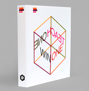
The Manual was designed by Lucienne Roberts, an independent design practitioner of studio, LucienneRoberts+, with a publishing venture on the side. Her brief was to make something completely different, something that could be written in, poured over and ultimately end up dog-eared and well-used.
“This D&AD Annual is a celebration of print as well as of the work it contains. It may use technologies that have been around for a while, but in all my 25+ years as a practitioner I have never been given carte blanche to play with them at will in the way that Andy so readily encouraged,” she commented.
“His brief was to ‘mess things up’ – which initially put me in a spin. I wrote a book about grids, cite artist Sol LeWitt and designer Jan Tschichold as influences, and spend far too long agonising about alignments than is good for me. Andy has the wrong person, I thought. But… it didn’t take long for us to rise to the challenge. This year sees softback binding, super thin paper and a mass of delectable overprints alongside distortions of the CMYK process. Less of a mess and more of a play.
“From the outset, we considered this year’s Annual as a learning tool. The winning work itself speaks volumes of course, but so does the printing and production, font use and layout. The font is FF Schulbuch Nord. The clue for its choice is in the name. ‘Schulbuch’ means school book in German and this font is based on the letterforms found in children’s textbooks.
“Befitting an Annual that is a learning tool, this year we have included a whole section of exercises (created by B+A) complete with empty boxes to write, scribble and draw in. The design and production of these pages also acts as a lesson in colour. Printed as a five-colour 24-page section, (two fluorescents and three ‘pure’ Pantone inks) it features some of the many combinations of tints and overprints possible, making secondary and tertiary colours. The representation of this year’s juries also act as a lesson in print, featuring colour images run in interestingly distorted CMYK. A key makes clear when the cyan plate is printed in magenta and so on.”
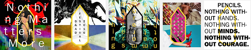
This has also been the year of the launch of D&AD Impact and Sandoz felt very strongly that this year’s Annual should reflect the values that he and D&AD believe in and lead by example, so this year’s edition is the most sustainable yet.
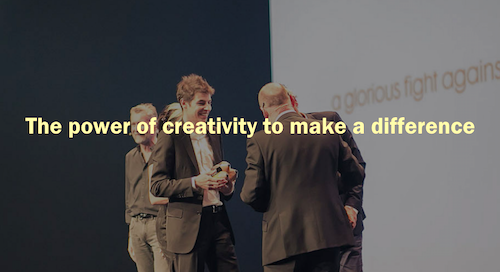
To achieve that without compromising on design, every component of the book production was considered, from reducing the amount of ink used to sustainable packaging. The book was printed with vegetable-based inks on 100% recycled, wood-free uncoated paper. The paper weight was reduced to 80gsm, the lowest you can go while still achieving good results on big printing presses. The hardback cover of previous editions is replaced with a soft one made from FSC certified paper, completely biodegradable, recyclable, and free of elemental chlorine, acid and heavy metals. Using a soft cover and reducing the paper weight achieved a 32% overall weight reduction which also significantly contributed to reducing carbon emissions throughout production and distribution.
For the third year running, D&AD’s partners, Hogarth, have provided the retouching, colour management and general reprographics for the book.