triple j is Australia’s youth radio station. It has been at the forefront of culture, pushing it forward. Never standing still. Never staying the same.
And yet, since its inception in 1957 its logo has remained static. Not any more.
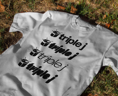
Howatson+Company has reinvigorated the brand for today’s listeners. And that begins with an ever-changing brand identity based on triple j’s ever-changing sounds.
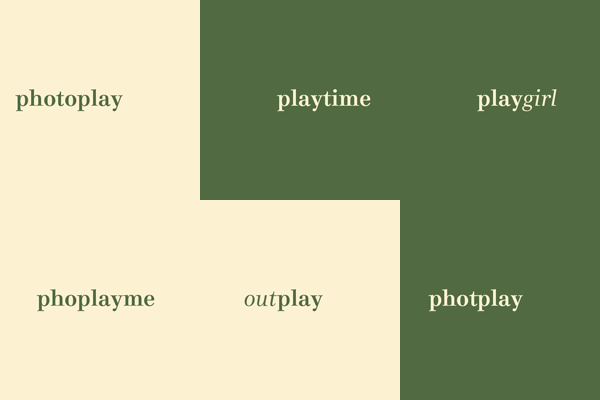
To make it, a custom variable typeface was designed that changes based on audio and musical inputs. The type was taught to respond to music and sound using algorithmic machine learning, creating a reactive design. This was used to generate unique titles across triple j’s content offering: The Hottest station title was made with the top songs from Hottest 100s of the last decade. Renowned cover segment, Like A Version, was made with its biggest hits. The title for the news and current affairs program, Hack, was crafted from the sounds of its most provocative episodes. To name just a few.
The brand’s most iconic element, the drum, was also updated to reflect the tastes of the station’s youth audience today, featuring a simplified base designed to reference digital soundbars and incorporate a hidden ‘j’.
The rebrand refreshes triple j’s visual world while preserving its core identity as a champion of youth culture and new Australian music.
The new brand identity was launched at triple j’s famous music festival, One Night Stand, and will continue to be rolled out across all assets in October.
Karen Madden, (acting) director of audiences at ABC, commented, “triple j is part of the fabric of Australia’s youth culture, and it was time for the brand to evolve and reflect this generation, today. The refreshed visual identity is born from the dynamic content that triple j continues to offer and One Night Stand was the perfect way to introduce the new brand identity to young Australians that was uniquely triple j.”
Gavin Chimes, chief creative officer at Howatson+Company, added, “triple j isn’t just a radio station. It’s the thudding 150 BPM heart of Aussie youth culture. It blasts on phones, laptops, in cars and on stages. Gflip even has the logo tattooed on their ankle. Our design system is made to reflect this energy. Always changing, always relevant. Able to keep up with the changing tastes of gen-z, gen-alpha, or gen-whatever-the-hell-comes-next.”
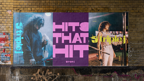
Ellena Mills, head of design at Howatson+Company, stated, “This project has been a true balancing act — honouring the brand’s heritage while resonating with youth culture today. From the new drum logo to the bespoke typeface to the grid system and colour palette, we considered and crafted every part of the brand. We’re immensely proud of the new triple j identity, which will continue to play a vital role in promoting Australian music and culture for years to come.”
Credits:
Client: ABC [triple j]
(Acting) Director of Audiences: Karen Madden
Group Marketing Manager, Audio: Fiona Lake
Marketing Manager, Music & Youth: Melissa Tracey
Marketing Specialist, Music & Youth: Alan Pigram
Marketing Coordinator, Music & Youth: Kirsten Nheu
Head of triple j, Double J & Country: Lachlan Macara
Agency: Howatson+Company
Chief Executive Officer: Chris Howatson
Chief Creative Officer: Gavin Chimes
Chief Strategy Officer: Dom Hickey
Chief Data and Technology Officer: Hoang Nguyen
Managing Partner: Rebecca Robertson
Head of Production: Holly Alexander
Head of Design: Ellena Mills
Creative Directors: Scott Zuliani, Jared Wicker
Design Director: Trent Michael
Designers: Jason Nguyen, Gabriella Dudman
Junior Designer: Phil Reyestan
Art Director: Phoebe Gribble
Copywriter: Olive Jones Evans
Studio Lead: Simon Merrifield
Finished Artist: Patrick Rivera
Senior Editor: King Yong
Group Business Director: Belle Simmonds
Business Director: Maddy Phillips
Lead Digital Producer: Beth Nokes
Full Stack Developer: Bao Luong
Briton Smith @ Familytype.co