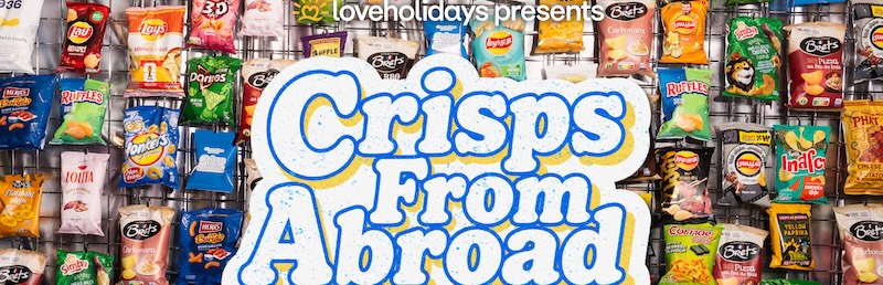
Whoever decided that a milk bottle has to be blue on white with a splash of yellow, some grass and a cow probably thought the idea was genius. Clearly, every one of that first brand’s competitors did too.
The trouble with “having what she has” becomes pretty obvious when all the competitive brands stand side by side.
Sydney’s Boxer & Co is having a rather nice run along the awards highway by selling its clients on the advantages of the mantra, “when the world zigs, zags.”
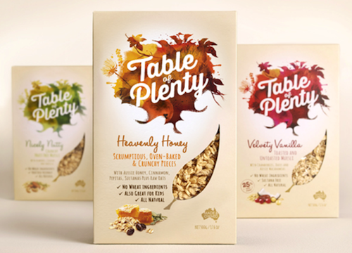
It is currently waiting with two finalist positions, for Food and for Outstanding Achievement Award: Design, in the 2014 Australian Packaging Design Awards, for Table of Plenty. These will be announced on November 24.
But its most recent work, for Brownes milk, is where Boxer & Co is creating point of difference that should be written in caps. Boxer & Co identified the “rules” for milk packaging, then determined that it would banish “the typical green grass, blue sky, black and white cow that’s so formulaic on milk packaging”.
This was a brave move for both design company and client. Brownes has been supplying Western Australian shoppers with local, quality milk since 1886. But the packaging didn’t reflect this relationship and made no emotional connection with the consumer. Although both knew that Brownes’ design had become dated, where Boxer dared to go was a new adventure.
With private labels nibbling at the edges of its 30% market share, Boxer knew it had to lead with Brownes’ reputation for quality and its WA credentials.
Despite new and trendier options, all the research showed that milk is still something that many Australians have a very emotional connection with. It represents purity and freshness and is nourishing, comforting and refreshing. It is filled with nostalgia and fond memories and it is central in consumers’ lives on a day-to-day basis.
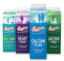
So provenance and purity both took a leading role in the design. But colour became its attention magnet. And identifying variants with colour made navigating the range incredibly simple. There are still cows to underscore the straight-from-the-farm nature of the product, but they are presented in a way that none of the other brands has though of.
Mark Haygarth, creative director, Boxer & Co, explained “It was important that we kept Brownes focused on their number one position, creating a pack that really connects with consumers by reminding them of the Brownes they have grown up with, but doing so with a fresh, modern approach.”
The hand-crafted typography on the front of pack is a nod towards Brownes’ heritage, but executed in a way that also has modernity and a strong on-shelf legibility. The design wraps around the pack, forming a Western Australian landscape that’s unique to each pack, and also tessellates across variants – so the story runs right across the range on a shelf. In the specialty range, people are added to the horizon, playing out scenes that are relevant to each variant, such as a child flying a kite on the Junior Milk.
…and then Boxer & Co made Brownes iced coffee and ice choc sizzle. Colour was a given. In flavoured milks, it’s not uniquely owned by Brownes Chill. But Boxer & Co found something else that would define Brownes Chill and give it an edge over its competitors. Flavoured milk drinkers differentiate by taste and strength of flavour. So this brand refresh became a team effort.
Brownes reformulated its entire range to deliver best tasting flavours. Boxer & Co set to work to translate better taste into designs that also grabbed attention from shelves becoming more and more crowded with new drink options.
And this is the result.
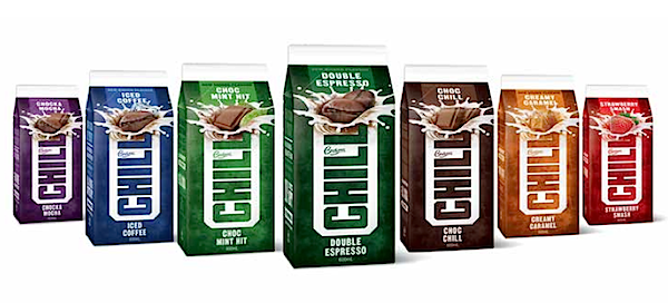
Bold colours. Vertical logo. Deep background colours. An emphatic flavour promise. All put together in a quirky way that underpins a brand that’s confident about what it’s offering. Plus dual facing packs for shelf stacking ease and better brand recognition.