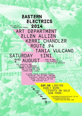
If you’re into the music scene, you will already know about the UK’s Eastern Electrics. It’s an electronic dance music festival that began as an underground warehouse rave in 2007 and has been held in unusual venues ever since. It features acts that push the boundaries, which doesn’t mean that it’s ad hoc and uncontrolled. This year’s festical on August 2 in the grounds of Hatfield House in Hertfordshire has a 10,000 crowd capacity.
And the festival has just been given a very cool rebrand by East London creative company, Accept & Proceed.
Accept & Proceed is perhaps best known for its work on Nike. But its work on Eastern Electrics best illustrates its motto, “Our approach is to deliver the obsessively inventive time and again.”
The new mark is – in the design team’s words – a “lightning bolt E” and a “bespoke electrifying variation of Simplon Mono font.” The agency used classic heavy metal motifs and acid colours to get there.
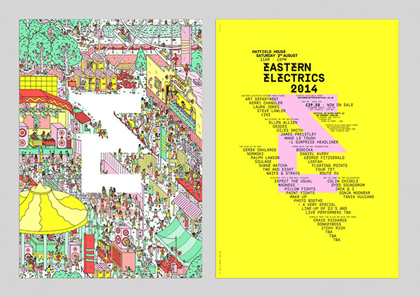
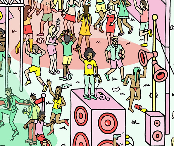
London illustrator, Matt Johnstone, created the wild Where’s Wally-like festival scene. In it, stories and characters from previous events and acts from the 2014 line-up are craftily concealed in the crowds. The festival stationery is printed in segments on the back of the four flyers, so that it lines up into a perfect poster format to create the full image.