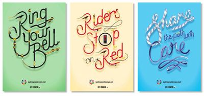
Think of an airport as the foyer and you begin to realise how important it is in setting the tone of every tourist’s visit. Sydney’s airport doesn’t have chandeliers, a marble reception desk or an imposing spiral staircase but it does have a new identity devised by Frost*. Sydney Airport is welcoming visitors in a whole new way with its new direction and positioning.
It has now become an airport for the people and very much part of Sydney, renamed Sydney’s airport rather than Sydney airport. There’s also a sense of personal welcome in the new name.
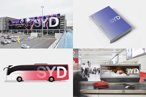
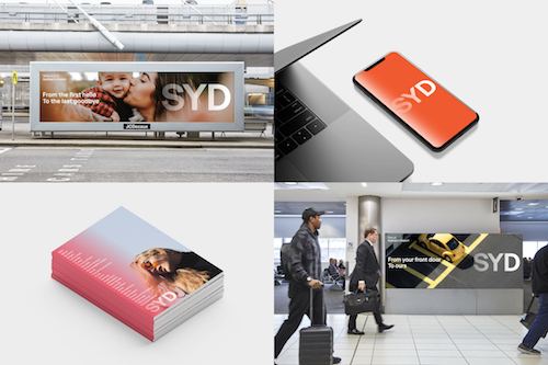
Frost* has also modernised the existing airport code logo using bolder, more contemporary letterforms, using Frost* trademark typography-leading approach. The new visual identity is brought to life using colour, pattern and natural photography that captures the spirit of Sydney and enhances the emotive response to the brand.
“Sydney is not one thing. It’s an international city, a cultural melting pot, an unmistakable landscape – it’s aglow with light and energy,” stated Frost* group creative director, Ant Donovan. “Our ambition was to connect the world to that Sydney feeling – that transformation that happens, the emotions we feel and the experiences we enjoy and return to time and time again.”
The graded logo suggests luminescence and movement, while the large colour palette underlines Sydney’s vibrancy and diversity. “We wanted to celebrate the brand’s offerings through the lens of Sydney’s unmistakable landscape,” Donovan added,. “to conjure a sense of place and make Sydney proud.”
The new messaging framework, “From want to need, from paddock to plate, from today to tomorrow,” communicates the breadth of airport services, such as tax-free shopping, food and parking, while the emotive tone of voice captures the joy of travel.
Sydney Airport chief executive officer, Geoff Culbert, stated “Our brand has been very corporate in the past and our Centenary provided the ideal timing to re-set.
“We play a big role in the lives of Sydneysiders every day, so we’re focused on investing in the things that matter, and that includes our brand. The new look SYD is fresh, bright and much more approachable helping us connect with customers in a more authentic way. We’re thrilled with the work from the team at Frost* and look forward to rolling it out across multiple touchpoints.”
Credits
Agency: Frost*collective
Group Creative Director: Ant Donovan
Designer: Chris Griffiths
You might also like