In the second week of January, Gumtree launched its rebrand by UK design studio, Koto. The new logo features a simplified tree icon and a more modern look.

James Greenfield, creative director and founder of Koto commented, “I think it had been very clear the previous logo had divided a lot of opinion. They’d done a lot of consumer research and I think it’s fair to say that it wasn’t liked that much: no one knew the reason Gumtree had started so the meaning had become quite lost.

The studio initially developed eleven creative ideas, from which four went through to testing with various stakeholders and members of the public.

There was a very clear winner. “Practically, Gumtree required a logo that works at a massive range of scales from the smallest mobile screen to the largest billboard. Emotionally, we wanted a tree that Gumtree could own, something that felt timeless, comfortable to all age ranges and not millennial. The result is a digital ready brand, fit for future purpose that will help reimagine how potential users see the brand,” Greenfield noted.

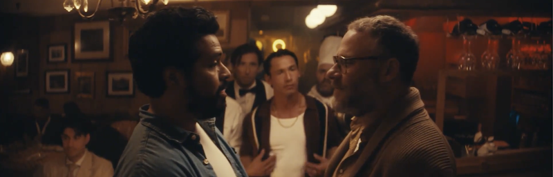
Fold7 has now released the new campaign that accompanies the rebrand in the UK. It’s a classic father-daughter tear-jerker that is running on TV and in cinemas in the UK, video-on-demand, out-of-home, radio and online.
Hannah Wilson, head of marketing at Gumtree, noted, “We set out to create a campaign that highlights the many opportunities Gumtree enables for people. Our previous campaigns have focussed on the fact that we are local, free and easy. We’re excited to now show the emotional relationship people have using Gumtree, with a beautiful new creative that truly reflects our values.”

Creative credits:
Rebrand: Koto
Creative director and founder: James Greenfield,
Campaign: Fold 7

Art director: Ben Ducker
Copywriter: Lucy Aston
Production company: Dark Energy
Director: Arni Thor Jonsson