In 2008, Andrew Seaton and Matt Samperi, founded a Sydney production company they called Mint. The two friends had grown up together, making films as kids and growing a passion for storytelling and the craft of filmmaking as young adults. Still students, they were producing creative works together and a commercial opportunity arose to do some corporate work. They formed Mint to help them complete that work. They’ve never looked back. Mint has grown into a production company that has worked on global campaigns for a wide range of brands, from Woolworths to Bunnings, Google, Amazon, Telstra, VW and McDonalds and won all the awards that matter, from Cannes Lions to Clio Awards, Andy Awards, Spike, AdFest, MAD Stars, ADC, Kinsale Shark and Award Awards.
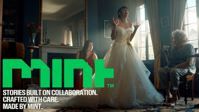
Now Mint has outgrown the visual identity it has worn for more than a decade. “It has served us well, but we knew that it was time for a change. We wanted a refresh of the brand that helped to illustrate to our current and future clients who we are as a production company; a more refined and mature offering than before, that at the heart of it, holds a passion for collaboration and craft,” Seaton and Samperi explained.
“The current creative landscape is evolving at an incredibly rapid pace, from daily advances in AI to the constantly evolving digital habits of audiences. As a team of filmmakers fuelled by collaboration and innovation, we see this as yet another great opportunity to work together with our creative partners to tell stories in new and exciting ways. That’s what this rebrand means to Mint. We want our creative partners to know that we’re not just used to disruption – we thrive on it. Our sweet spot is collaborating with other great creatives to bring exceptional and diverse ideas to life, no matter the creative or logistical obstacles involved. We love the challenge and we’re here for the long haul.”
The founders talked to The Stable about challenge, the pride of a job done well and what the rebrand means to them.
The Stable: What challenges have you conquered to get to where Mint is now?
Seaton & Samperi: We started the production company when we were young and fresh-faced, working with small crews and lean budgets. Our biggest challenge has been changing the perception people had about us as young creatives. Our continued quality of work has been the best tool to overcome that though.
TS: What are you most proud of?
Seaton & Samperi: I think we are most proud of Spitting Symphony for Single O, a spot we crafted during a Covid lockdown. It’s the least Covid-safe spot you could think of, but we worked safely and smartly and produced this award-winning work that we think nails the balance of quirk, humour and style.
We’re also proud that we’ve been able to help other creatives grow. Our sets have been the stomping ground for young up-and-coming artists for a long time and we are proud to see those who were once our on-set PAs now accomplished directors, producers and DOPS.
And we are proud of the fun, safe and caring culture that we have developed both on and off set. Both our crew and clients reflect consistently that we don’t just produce great work, but that they genuinely love working with us.
TS: What are your aims for the rebrand? What do you hope it will do?
Seaton & Samperi: We hope that the rebrand illustrates the ways in which the production company has grown, matured and refined over the years. It still retains a lot of the hallmarks of the old brand because the people who make up the production company haven’t changed and our commitment to collaboration and craft is still what drives us. But, at the same time, Mint has grown in its capacity to consistently produce unique concepts with incredibly high production value, no matter the scale.
Our refreshed visual and verbal identity reflects our core values of creativity, craft, relationships, people and reliability, which we have lived and breathed for over 15 years. We feel that this comes at a pivotal time, where we see massive technological disruption combined with a relentless pursuit of blockbuster quality at ever increasing efficiency. So, we hope that the rebrand results in existing and new clients seeing us in this light – as a trusted, mature, collaborative and creative partner to bring their unique ideas to the screen.
TS: What were the stylistic decisions behind the rebrand elements?
Seaton & Samperi: We wanted a brand that was reflective of the maturing of the production company. Something that felt contemporary and a little bit playful. Christopher Doyle and Co. came up with the wordmark that we loved. The boldness of the design had earmarks of our old branding but elevated it to a more refined look. We loved the simple blockiness of it. It reminds us of pixels and speaks to the digital environment that we as filmmakers work in.
Mint has always been at the forefront of using the latest tech to bring ideas to life when it comes to filmmaking. We were early adopters during the DSLR revolution over a decade ago, we were some of the first in Australia to pioneer the use of the D2 Slim robot arm, and we have always pushed our post-production capabilities to produce world class deliverables from our formidable Glebe-based edit suites. So having a visual identity that also spoke to that creative and innovative tech side was crucial.
The use of text and space was also important to the design. Bold headings coupled with tight compact fonts gave a modern and curated look. Christopher Doyle & Co. presented our heading font, Review Condensed, as a nod to a newspaper headline. We loved this conceptual link. While we’re not in the world of print, we are constantly announcing something to the world through our work.
The colour, green, was one that we felt was really ownable and usable in the space. The colour worked beautifully in a wide range of uses and didn’t compete when placed over images or on solid colours alike. We were very conscious not to get anywhere close to any “mint” clichés and feel that Christopher Doyle & Co. toed this line beautifully – providing us with a bold Mint colour coupled with strong geometric shapes that provides a strong and unique visual identity.

The rebrand also subtly underlines the production company’s mission to take good ideas and bring them to life by being innovative and passionate storytellers.
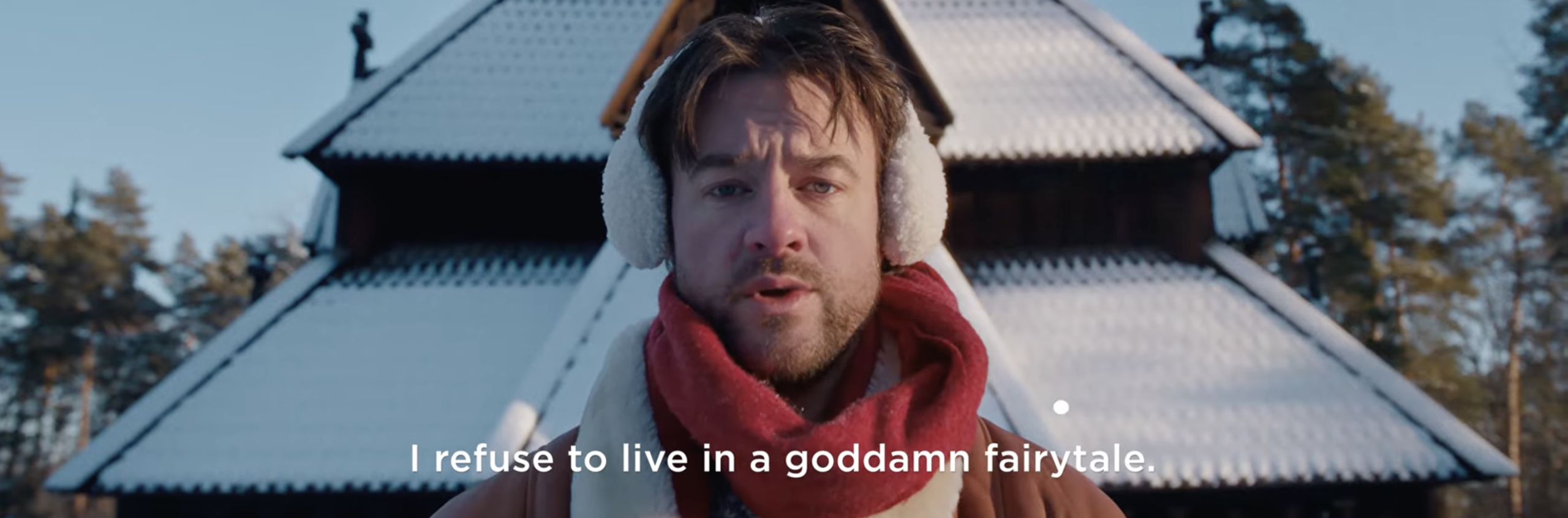
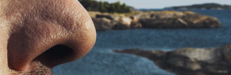
Here are some examples of that mission in working: