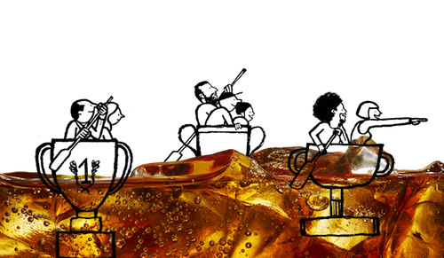
Most creatives are easily ignited by the freedom of first challenges, fresh briefs and blank canvasses. Most jobs, though, come with some of the pieces already set in place. Nailing these jobs is, in fact, the ultimate challenge.
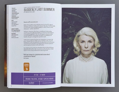
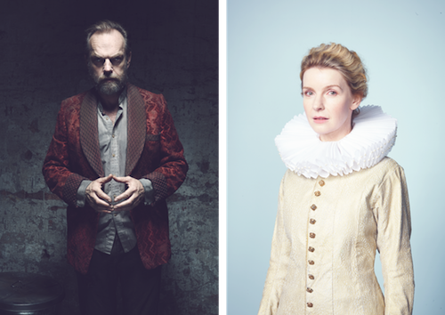
Collider has just finished its work for Sydney Theatre Company’s Season 2015 – its fourth year of making sure that theatre goers become captivated by its productions and excited to see actors like Cate Blanchett, Geoffrey Rush, Hugo Weaving and Richard Roxburgh perform for them.
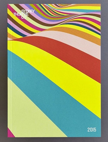
“After a few creative iterations, the final pattern evolved as a dynamic, undulating landscape which felt like the perfect follow up for last year’s colour series for STC. As well as the season pattern, we designed a 64 page season brochure (including detailed infographics), 2015 calendar, press ads, postcards, outdoor executions, taxi backs, Adshels, presentation folders, ticket wallets, flags and tote bags,” Liz Keene stated.
After all that, Collider also create a 90 second trailer, that features footage of the cast from each of this year’s fifteeen productions.
Creative credits:
Creative director: Andrew van der Westhuyzen, Collider
Season photography: James Green
Styling: Renee Mulder
Trailer: Directed by Damon Cameron for Particle Films
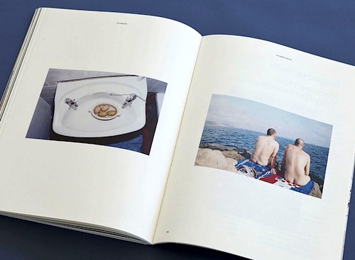
Collider rebranded Artbank early in 2013. That went really well – so much so that the design studio was given the design, typography and art direction of Artbank’s (then) new biannual magazine, Sturgeon. At the core of the brief was a statement, “It’s one thing being a big fish, it’s another if you produce caviar.” The magazine is a showcase for the culture surrounding contemporary art in Australia. It had to be classy with a quirky edge. And that’s exactly what Collider produced.
The brief for Issue 2 came with more than a statement. It came with type set in an unconventional manner, a clean layout style and an established masthead. Issue 1 had also been given a standout gatefold cover with recto/verso portraits of Graeme Sturgeon by Collider collaborator, Clemens Habicht, and a catalogue-style blogzine insert by Melbourne artist Kenny Pittock.
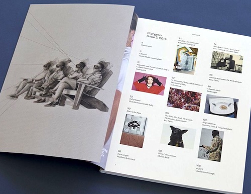
The aim this time was to progress, not invent, the look and feel of the magazine. Typography remains set to a formal 2-column grid (with occasional variation) to accommodate to the wide range of artists’ works and photography throughout. Issue 2’s artists include Deborah Kelly, Vicky Brown, Helen Grace, Anthony Lister, Shaun Gladwell, Agatha Gothe-Snape, Jelena Telecki, Mitch Cairns, Archie Moore, David Rosetzky and Tony Garifalakis, and there is a photo story by Paul Knight.
The gatefold was retained. This second one incorporate commissioned wrap-around cover artwork by Teo Treloar.
Creative credits are:
Design: Mitchell Brown, Collider
Print: Spitting Image
You might also like