Three in five Brits say they’re actively trying to eat well. Most of them will fail – not through lack of willpower, but through lack of time and lack of trust. The food sector is saturated with contradictory claims, unrecognisable ingredients and the relentless noise of diet culture, eating clean has quietly become one of the hardest things to do consistently.
The rules keep changing. The labels keep lying. And the time to figure it all out? There isn’t any. This is where HIDE steps in and agency, Among Equals, points that out with its brand design. Loud. Open. Unapologetically transparent. The HIDE brand identity doesn’t just communicate the product’s values. It is them.
At a moment when more than three-quarters of UK consumers are actively concerned about what’s in their food, HIDE has arrived with a radical proposition: a meal prep brand with absolutely nothing to hide. No hidden ingredients. No compromises on quality.

HIDE was founded on a single, non-negotiable idea: that people deserve to know exactly what they’re eating. Every HIDE meal is prepared using healthy, whole ingredients, with a full, clearly stated ingredient list on every single pack. No small print. No sleight of hand. Just food that does exactly what it says.
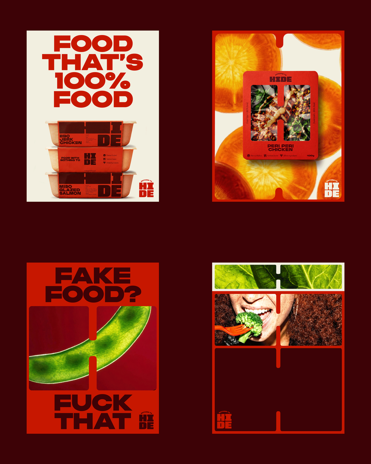
For Among Equals, the HIDE brief was as clear as the brand’s founding principle – design a visual identity with absolutely nothing to hide. Every creative decision ladders back to that strategic idea. The result is a brand system that’s bold, honest and uncompromising – just like the food.
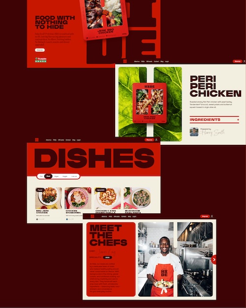
The ‘H’ leads the way, functioning as a dynamic window rather than a static logo mark. The H scales and adapts across every layout, acting as both a literal and conceptual frame for HIDE’s ingredients and meals. It is a transparency device in the truest sense – a visual proof point that the brand puts everything on display.
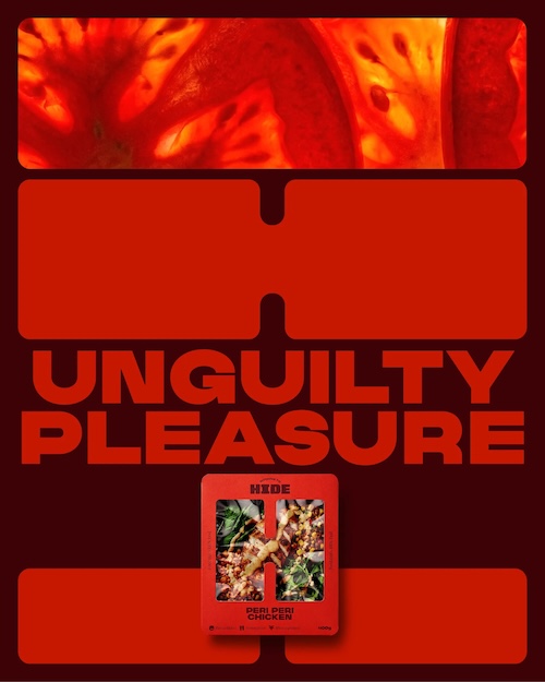
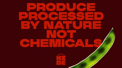

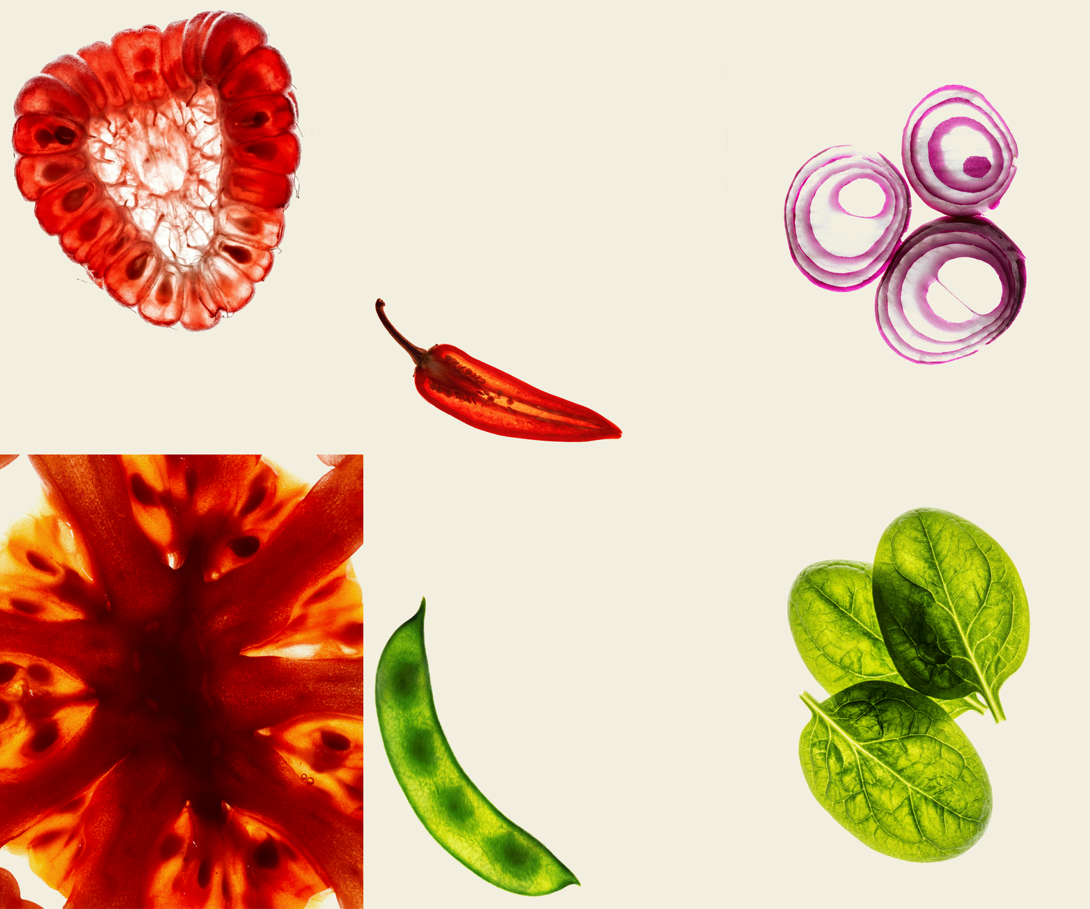
The photography follows suit. Deliberately rejecting the polished, soft-lit conventions of the food and wellness category, Among Equals opted for high-exposure, flash-lit and backlit ingredient imagery that feels raw, exposed and completely unfiltered. Inspired by the forensic clarity of X-ray imagery, the art direction pulls everything into the light — revealing what’s inside every meal, every ingredient, every pack. What you see is exactly what you get.
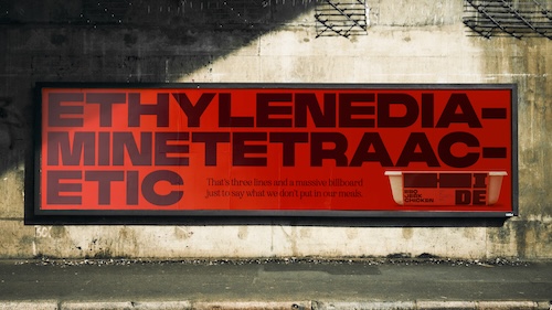
The tone of voice holds the same line. No wellness waffle. No clean-eating clichés. Just honest, direct language that reflects a brand confident enough to say exactly what it means. And the visual system, anchored by a bold red palette, loud typography and the ever-present H, ensures that the HIDE confidence is impossible to miss, at any scale, across any touchpoint, in every aisle.
“Right now, more than three quarters of UK consumers don’t trust what’s in their food. That’s not a niche concern — that’s a cultural crisis. HIDE was created to meet that moment head on, and we designed a brand identity to match. Nothing softened. Nothing obscured. Everything on show. Because when your entire brand is built on transparency, your design can’t afford to be anything less,” stated Emily Jeffrey-Barrett, founder, Among Equals
“Eating well shouldn’t be this complicated, there’s more noise, more conflicting advice, and more pressure around food than ever before, but the meals that are actually good for you are still out of reach for most people, too expensive and too inconvenient. That’s the gap we’re trying to close. HIDE is built around one simple belief: that our meals should taste incredible, be made with honest ingredients, and be priced so that more people in the UK can eat well every day. This is just the start…there’s a lot more to come,” added Faraz Nagree, founder and CEO of Lean Kitchen Network and founder of HIDE.