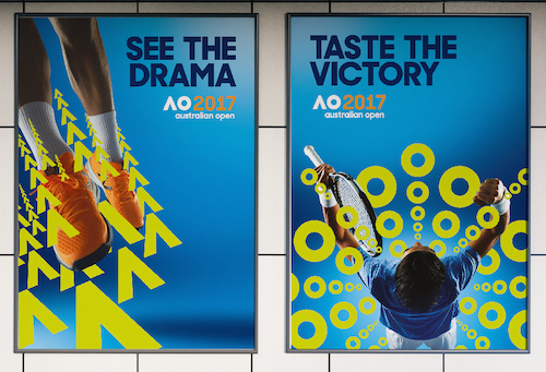
The Australia Open wanted to be more visible. Wanted to be seen as the entertainment brand that connects with new audiences and creates a world of tennis around them. And needed a new brand identity that reflected its fun and playful nature and had the flexibility to respond to new media opportunities to engage with fans.
Landor Australia partnered with Tennis Australia to achieve that.
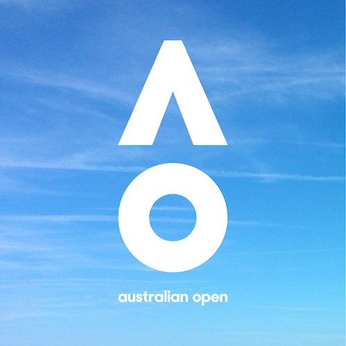
Tennis Australia chief executive officer, Craig Tiley, explained, “The Australian Open is renowned as one of the most innovative sports and entertainment events in the world. To ensure we optimise the many new media opportunities available now and in the future, we also needed to evolve our look and feel, make it more relevant globally and more adaptable in an increasingly digital world.
“The result is a dynamic new look that will give us the flexibility to engage more deeply with our fans, partners and the players. It’s fresh, fun and often playful – just like the Australian Open itself.”
Dominic Walsh, Landor Australia managing director, added, “So while the brand needed to remain simple and recognisable, it also needed to be given the flexibility to be agile – adapting and responding to the environment.”
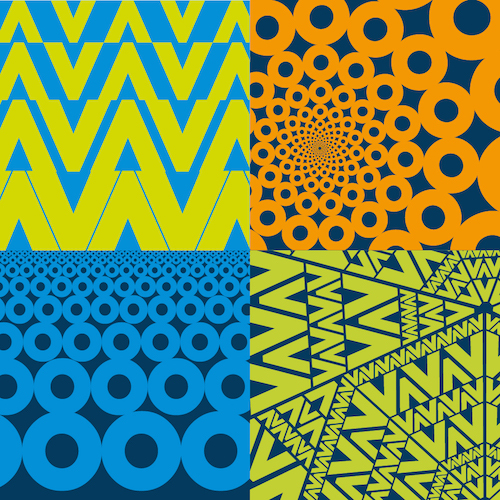
Mike Staniford, Landor executive creative director, noted, “We wanted to create a living system which could animate and move in accordance with the dynamic of the game itself. A bold, energetic and active identity to reflect this leading sporting experience that embodies Australia.
“The simplicity of the mark gives it the license to do almost anything. It’s not only a short hand to the Australian Open, it’s a mark that is a timeless icon that can be the vehicle of constant reinvention.”
You might also like