Turner Duckworth has created visual identity work for Burger King and Subway. Now it has revamped the look and feel of McDonald’s – which, with its 35,000 restaurants on 120 countries and many different agencies throughout the world, was anything but cohesive. The agency was chosen towards the end of 2017 to give the brand a makeover. Pieces of the new visual work have been appearing since then. The job is now complete.
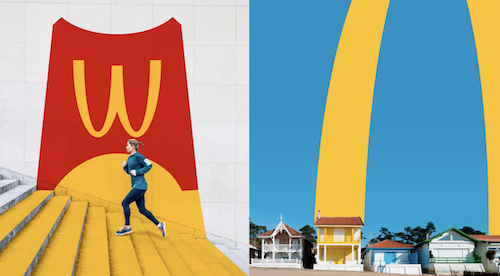
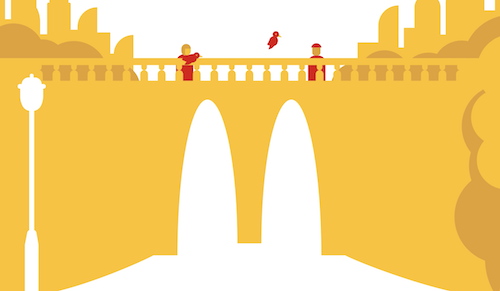
All of McDonald’s visual symbols – the Golden Arches, a Big Mac, a red container of fries, Ronald McDonald, many fonts, rainbow colour palette and assortment of logos have been brought together, simplified and unified.
The Turner Duckworth team used as its inspiration the joyful legacy of McDonald’s You deserve a break today, campaign from 1971, by Needham, Harper & Steers in Chicago. Its main aims were to declutter, highlight what was already standing out and identify any opportunities that were being missed.
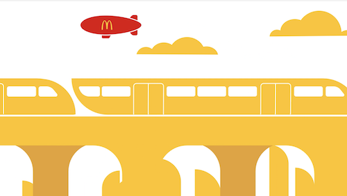
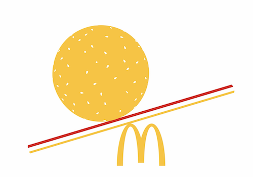
McDonald’s golden arches remain as the brand’s cornerstone and are now free to stand on their own without the McDonald’s wordmark. Different markets are now allowed to be more creative with the arches. McDonald’s golden yellow has taken over from red as the dominant colour. The agency felt that red was the default colour of the fast-service restaurant category and that yellow with its sunshine association was a happy colour. There is now one font, Speedee.

Lastly, the agency has introduced the principal, “flawsome”, which celebrates the quirks and irregularities of food. Fries don’t have to be arranged in a regular pattern. Buns don’t have to be perfectly aligned. Melted cheese doesn’t have to form a regular pattern.
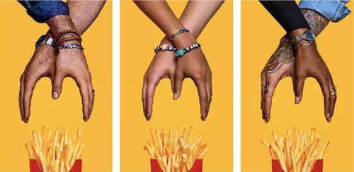
This can be seen in McDonald’s recent National French Fry Day campaign by We Are Unlimited, in support of diversity. (Yes, America has a National French Fry Day, July 13.)