In 2013, former Arsenal footballer, Mathieu Flamini, co-founded GFBiochemicals, a company that creates safe, sustainable and high-performing natural alternatives to the fossil-based ingredients used in everyday products, from paints to shampoos with flagship technology product, RE:CHEMISTRY.
NOT Wieden+Kennedy, the branding and design arm of W+K London, has given RE:CHEMISTRY a new look and positioning that underlines how its technology offers a new way of thinking about the everyday products.
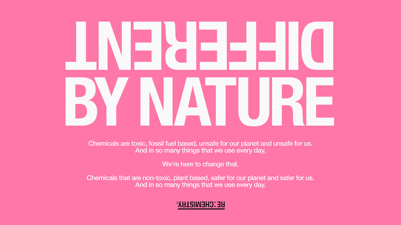
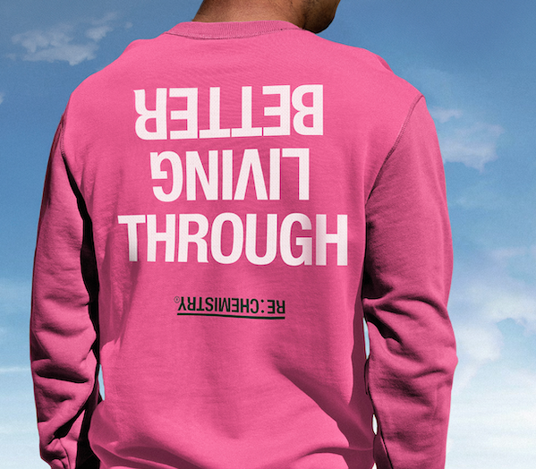
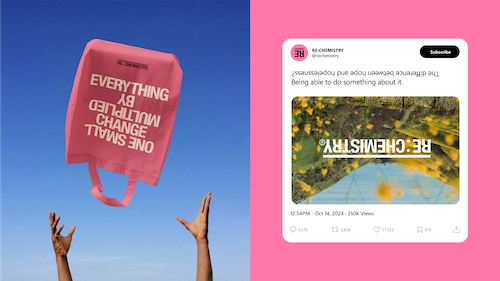
The design agency’s job was to create a campaign with new brand visuals that presented GFBiochemicals as an established leader in the rapidly growing industry of renewable chemistry, and now unveiled the new name and brand identity for its flagship product. To encapsulate how RE:CHEMISTRY offers a new way of thinking about the everyday products in our world – turning them on their head with a complicated-yet-simple solution to their chemical make-up, and offering change on a huge scale – NOT Wieden+Kennedy introduced the idea of the ‘flip’ as the central thought to the product’s visual identity.
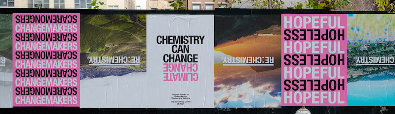
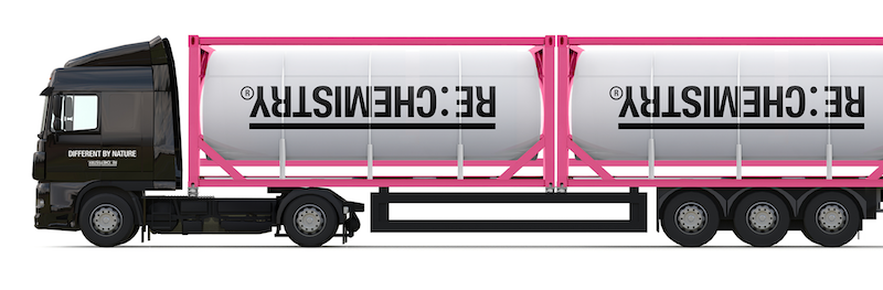
This shows in the logo quite literally flipped on its head; upside down typography; a writing style that explores words with opposite meaning; and the use of flipped imagery of everyday products and natural scenes featured prominently on the RE:CHEMISTRYwebsite and in other communications.
The primary brand colour of vibrant pink further emphasises difference and opposites, as a unique choice in an industry known for focusing on the blues and greens typically associated with nature. Meanwhile, the name of RE:CHEMISTRY was chosen as both a literal description of what the technology does, reformulating products, and asserting ownership of its place in the industry.
Mathieu Flamini, co-founder and CEO, GFBiochemicals, commented, “We are delighted with the work, and our identity that will proudly represent us as we continue our aim of ending chemical pollution in consumer products. It’s a visual concept that demands your attention, and communicates the powerful change RE:CHEMISTRY can have on products and, in turn, the world. At GFBiochemicals, we have always believed that chemistry can change our lives for the better, and we’re proud to be able to present RE:CHEMISTRY, a vibrant brand that reflects this radical optimism.”
Adam Rix, head of NOT Wieden+Kennedy, explained, “We were inspired by the power their company had to completely change everything we use everyday for the better – for people, and for the planet. We challenged ourselves to tell that story of change in the most simple and compelling way possible, while purposefully steering clear of the tropes of the category. Perhaps most importantly, we wanted to create an identity that gave people hope for the impact the right kind of chemistry can have on our future.
“When we initially partnered with Mathieu and the team at GFBiochemicals, named so after the initials of the two founders, RE:CHEMISTRY only existed as a strapline. Our first conversation with them was to suggest that RE:CHEMISTRY should become the brand name for their core product. Because it both describes what they do, and asserts ownership as an established player in the burgeoning sector of renewable chemistry.
He added, “Next up, we needed a visual identity that told their story and stood out in the chemistry and sustainability sectors. Those are – generally – worlds of cold, unapproachable design that leans into the process of the science much more than the exciting results it produces. Worlds of vaguely scientific names, macro photography, and molecules – and a sustainability-focused sea of green & blue colour palettes and plant iconography. Instead, as a predominantly B2B brand with limited opportunities to show up in the world, we wanted to build the identity around a strong single colour. We settled on pink – it reflects the optimism and energy of the business, and stands out in that sea of blues and greens. Really, it’s a simple idea that positions RE:CHEMISTRY as a paradigm shifting solution, something instantly recognisable, and something that cuts through the countless other brands out there.
“We’re also passionate about how the branding focuses on the possibilities of chemistry to slow down climate change, and doesn’t put emphasis on the end user. In this sense, it creates a feel of hopefulness, rather than focusing on scaremongering – which is so easy to do in this sector.”
Credits
Design Agency: NOT Wieden + Kennedy
Head of NOT WK Creative: Adam Rix
Head of NOT WK Business: Anika Ramani
Global Chief Strategy Officer : Dan Hill
Strategy Director: Brian Ritter
Senior Designers: Jonny Isaacson, Robert Loeber, Julia Kuisma
Motion Designer: Jon Harris
Copywriter: Sophie Bodoh
Director: Christina Pavlou