Stephanie Oley is a partner at The Offices, the Sydney design agency that’s doing what it takes to make brands stand out.
Standing out takes bravery. “Our branding work for food companies to date sometimes dips ever so slightly into the world of design trends, but mostly we encourage brands to blaze their own trails.”
So follow the big brand trends? No, that’s not Oley’s advice. This is:
Ask any food producer what their branding and packaging priorities are, and the response is unanimous: to stand out on a retailer’s shelves. But from an actual design standpoint, the execution of this goal varies surprisingly little in the present market. There’s cautiously different, or same-same-but-louder. This was our overwhelming perception following a field trip to the Fine Foods Australia trade show in September.
We should mention that food production is big business in Australia. Not only are Australians spending more on quality food than in the past, our overseas customers are too. Food production was tipped in a recent Deloitte report as being a sector to watch for the next 20 years; and according to an infographic at the September fair, Australian food exports now exceed imports by 50%.
Growing health awareness, demand for organics, rising food allergies and intolerances, and interest in food provenance are making for some interesting market conditions. With a little more experimentation, these will in turn shape the branding and design landscape.
Design starting-points for food brands
First off, packaging needs to look as though it actually contains something tasty. Cue vibrant, drool-inducing photography. Not moody or lifestyle photography. Secondly, it needs to state what’s inside. This gets complicated when you take labelling restrictions into account. Some packaging ends up clogged with a bunch of tasty synonyms, to compensate for bulking agents or preservatives that alter their product category (think dairy desserts against ice creams, or fruit drinks versus juices). And third, the design needs to state how it’s different from 15 near-identical competitors, in one single eyeball’s sweep of a supermarket shelf. Tall order, we agree.
With all that in mind, here’s how the big names and newcomers alike have been differentiating their brands in 2017 when it comes to package design.
The majors: More is more
Packaging design among the major brands remains conservative at best, drawing on decades-old stylistic touches. Repetition abounds, making it hard to tell one potato crisp, orange juice or dairy brand from another. Yet, this is what made the majors look like – well – majors.
Busy primary and secondary colour palettes are generally the go (blue! green! yellow!), with luxurious brands always calling for black, gold or silver.
Clutter is de rigueur. Add a swoosh, a gradient, a starburst, a ribbon and a gloss effect – all on the one package if possible. Plus at least three types of font. And a swirling marbled background, just because they can.
Photography is either bright and airy or hyper-retouched, with the finished product having the perfection of a Fabergé jewel. Art direction for hand-finished foods always involves rustic chopping blocks, while your more artificial foods call for shiny, colourful backgrounds.
Conclusion: if you want to reach the everyman, just throw as many familiar visuals at them as you can. Bingo!
The niche brands: Pure and virtuous
A tiny number of the indie brands have a fun persona, like Nudie juices or Alter Eco chocolates, where the playful tone extends right down to the tiniest line of copy on each pack.
But for the most part, branding has overtones of old-school, purity, health and virtue among the niche producers. Here’s how they’re doing it.
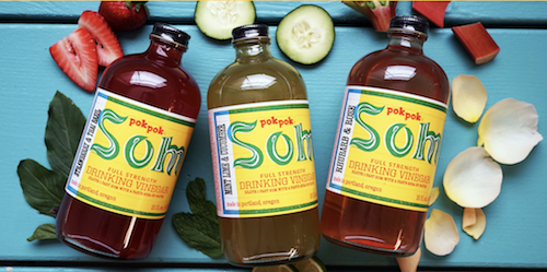
1. Heritage – few styles say ‘authenticity’ in the same way that a vintage typeface, crest, stamp or embossing can, with examples including older smallgoods, gelato and coffee companies. By the way, ‘heritage’ isn’t always Euro in nature, as seen by the Thai-inspired Pok Pok Som range of drinking vinegars.
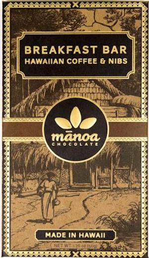
2. Eco-luxe – real sustainable food is a luxury in today’s fast everything world. Food brands are bringing this notion to life with recycled paper, forest greens and earthy browns for virtue factor, plus metallics and embossing for luxury. The branding for Hawaiian entry, Manoa Chocolates, does all of the above.
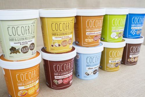
3. Colour block – we’re still loving this trend, where the palette is so minimal the overall effect is actually a big radiant burst of colour. Not a bad technique for ensuring shelf presence, as the folks from Cocofrio and Soda Press Co are proving.
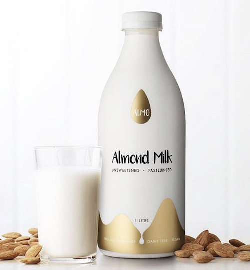
4. White-out – in direct contrast to colour blocks (above), there’s the decluttered white-on-white look. These brands appear to claim extra shelf space, simply by looking like they’re not there. Coyo and Almo Milk do this beautifully, especially since purity and whiteness is exactly what you’ll find inside each pack.
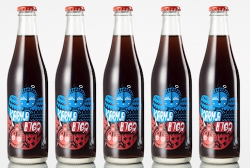
6. Hand-drawn – flat minimal graphics and typefaces are, like, so five years ago. Hand-drawn is the new prestige touch, either in a monoline finish for a naïve effect, or layered for a nuanced arty effect. Manly Spirits Co is an example of the former, and Karma Cola an example of the latter.
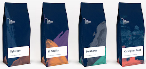
7. Ye olde corner shoppe – personally we’re kinda sick of this look, which we’ve dubbed the hipster graphic look. It’s achieved through charmingly jumbled fonts and shredded inks, and is mostly big with cafés, boutique beers and bakeries. Five Senses Coffee interprets the look nicely with a more tidied-up pairing of different fonts, plus some illustrations, which should last them until well after the trend subsides.
Conclusion: if you’re a niche brand, develop a brand identity as far removed from the majors as possible, using niche design and production techniques. Your target audience will totally get it.